- Uncharted Area
- Posts
- No More Tableau Terrors 🎃
No More Tableau Terrors 🎃
But you can still make spooky visualizations!
Tristan Guillevin & Jessica Bautista
November 02, 2023
Last week, I was invited by Louis Yu to present (remotely) at the Singapore Tableau User Group for a Halloween special event: Spooktacular Data Viz 🎃.

All intro images have been generated with Dall-E3.
This event was a great occasion to showcase, in twenty minutes, our different tools and give a big update on our Figma to Tableau plugin (still planned to be released in November).
I covered three scary aspects of Tableau and how you can easily fight them, and I concluded by still making a frightening visualization to celebrate Halloween! Let me take you through the presentations.
All demos were done using one dataset from The Number, which you can find here. It contains the 666 highest-grossing horror movies since 1960.
The Ghost of Mathematical Formula 👻

I started using Tableau in 2015 when I joined Actinvision. At that time, my former boss, Olivier Catherin, invented a technique to build a Sankey Diagram in Tableau using Sigmoig functions and data densification. With time, the technique got better, and the Flerlage twins have even created templates to simplify the process.
It all works well and looks good, but I have a confession: I never used these techniques. It felt too long and hacky for something that should be natively part of Tableau.
And that is why, last year, I started working on AdvViz. I wanted to simplify that process as much as possible and enable anyone to make a Sankey (or other advanced charts) in Tableau quickly.
Using our Horror Movies dataset, we visualized all the movies using a Beeswarm by released date and worldwide box office in just a minute:

Make a Beeswarm in Tableau in one minute!
It’s no longer scary to make advanced charts in Tableau.
The Void of Useless Clicks ⚫️

No tool is perfect. And Tableau doesn’t break that rule.
Tableau is fantastic for connecting to data, exploring the data, and creating interactivity with actions. There are, on the other hand, many pain points when it comes to creating a dashboard. And one of them is the amount of clicks necessary to create things that seem effortless.
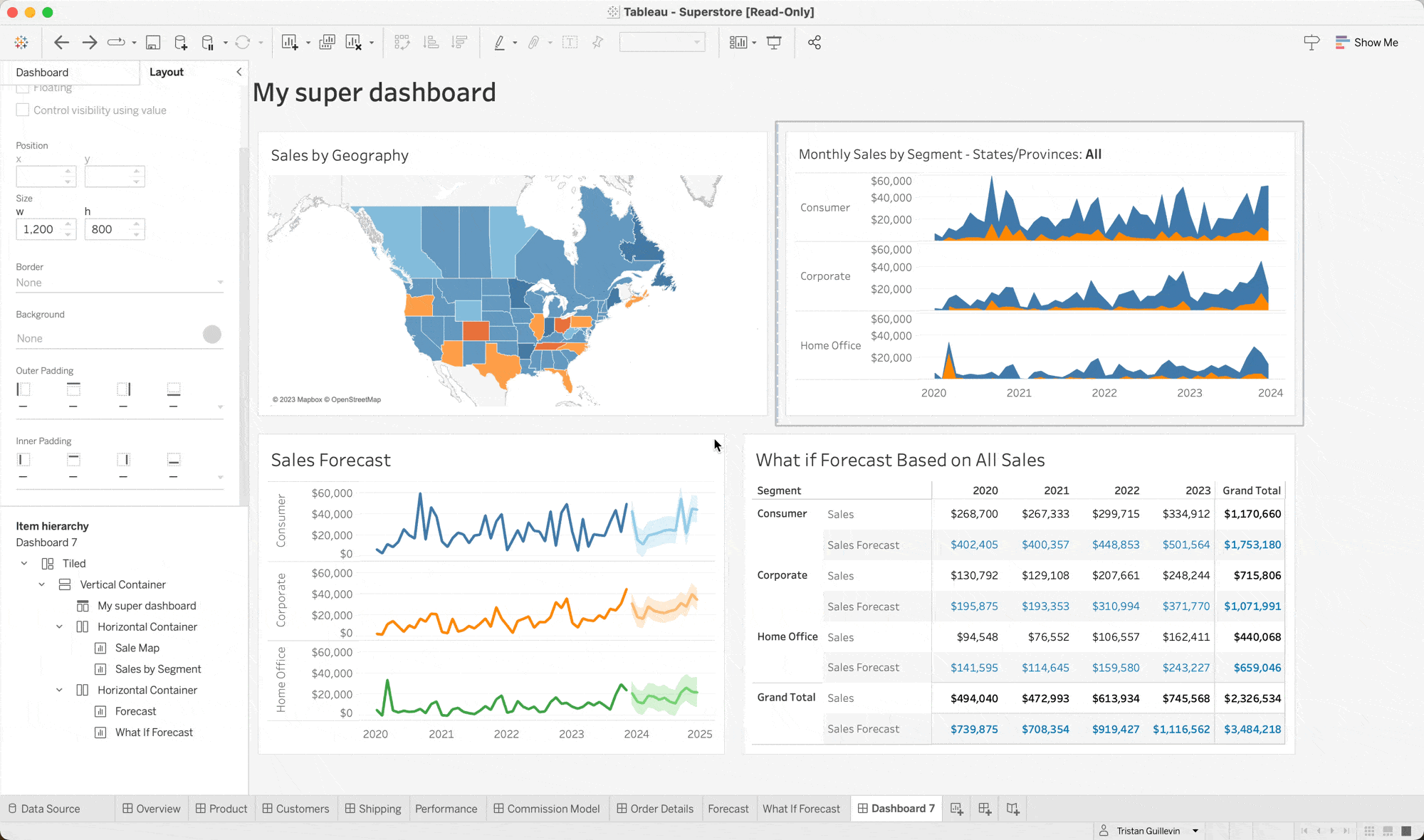
I build KPI Tracker dashboards for my clients all the time, but I was always annoyed by the time I spend making it. One KPI in Tableau requires a minimum of six calculations because there is no dynamic formatting. It’s also impossible to duplicate containers with sheets, so you need to set the padding, background, size, and border of every KPI.

Again, trying to simplify this process, I created a tool, BANg, that generates all the calculations and all the worksheets and takes care of all the dashboard formatting so you can save hours of work.
Here’s an example of using BANg with the Horror Movies dataset. We created a dynamic KPI Dashboard showing the average Domestic, International, and Worldwide Box Office by year for the past twenty years again in just a minute:

It’s no longer scary to create many KPIs in Tableau.
The Infinite Tiled of Doom ∞

If you have used any design tool like Figma or Canva, you may (rightly) be frustrated at the experience of building a UI in Tableau. It feels outdated.
On top of that, annoying behaviors that existed when I started using the tool in 2015 are still not fixed today. Take this example below: why do we still need to teach, in 2023, that you can’t use the nice arrow to align elements because it will break the containers and add an unnecessary “Tiled” block?
Why Tableau?
Figma is an excellent tool for building UI, but it can’t connect to data. Tableau is great at connecting to data, but building a nice UI is a pain. Do you see where this is going?
Soon, you can build your dashboard directly in Figma and export it to Tableau with one click. Here you can see how we created a complex dashboard with the Beeswarm and the KPIs in Figma and exported it in Tableau:

If you use Auto-Layout, the plugin will automatically create the containers in Tableau for you. Otherwise, you can export the design as a Floating or Background Image (if you use shadows or rounded corners, for example).
You can upload a workbook and add your existing worksheets to the design. If you don’t upload a workbook, the plugin will automatically create dummy worksheets connected to Sample Superstore that you can replace in Tableau.

Soon, it’ll no longer be scary to build complex user interfaces in Tableau.
But you can still make scary visualizations 😱
To fit the Halloween theme and still add a bit of spookiness to the presentation, we decided to corrupt the innocent Beeswarm.
Using the same technique explained in our previous newsletter, we transformed the initial Beeswarm into something spooky for Halloween! Jessica drew a small scary circle and unique icons for the top 10 movies.

After applying the shapes to the Beeswarm, we built our design in Figma and exported it to Tableau again in one click. For this dashboard, we used Floating elements and asked the plugin to convert the Texts to Images since we are not using a web-safe Tableau font:

Here’s the final result; check it on Tableau Public to discover all the movies:

I hope you liked this newsletter as much as I enjoyed working on this presentation. It was a great recap of our existing tools and some preview of the upcoming one!
That’s it for this week!
You can reach us easily over there:
‣ Website: https://www.ladataviz.com
‣ Twitter/X : https://twitter.com/ladataviz
‣ Youtube: https://www.youtube.com/@ladataviz
‣ LinkedIn: https://www.linkedin.com/in/ladataviz/
‣ All other links: https://linktr.ee/ladataviz
If you have any suggestions, feedback is appreciated!