- Uncharted Area
- Posts
- Making Information more Beautiful
Making Information more Beautiful
and some product and event updates
Tristan Guillevin
September 07, 2023
Welcome to Uncharted Area!
Yes, the newsletter went through some rebranding, and we’ll all agree it’s better than the “Ladataviz Newsletter”).
The content will not change much; I’ll do my best to share (more often) news about the three main topics: data visualization, product updates, and our journey as a small remote dataviz studio.
This week, I want to share an update on BANg, some thoughts about the Information is Beautiful Awards, some nice Tableau Public visualizations, and upcoming events.
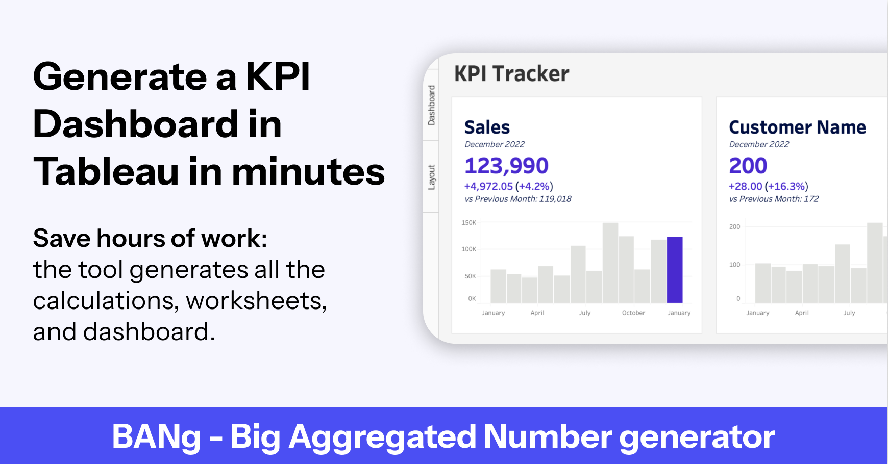
Create Line and Area Chart with BANg
One of the most requested features (after the dynamic date selection released a few weeks ago) is now available. You can now display your KPI evolution as a bar 📊, line 📈, or area chart.

If you’re new to the newsletter or unsure what BANg is or how to use it, you can check out my YouTube video. In one sentence, BANg is my latest tool that allows you to build a KPI dashboard in just minutes by generating all the calculations, worksheets, and a nice dashboard directly in your workbook.
Coming soon(ish):
Compare your KPI with a target
Generate KPIs based on different data sources
Generate the calculations without the sheets or dashboard
Generate just the worksheet and dashboard if you already have all the calculations ready
You can use the tool for free for a week, so give it a try!
Information is Beautiful with AdvViz!
Between working with clients, building products, and creating content, I barely published any visualizations this year and had nothing to share at the annual Information is Beautiful Awards.
It was a pleasant surprise when I started to get mentioned for visualizations featured in the Long List because people used AdvViz to create networks, Voronoï treemap, Sankeys, and more for their Tableau Public dashboard.
Here’s all (hopefully I didn’t miss any) the Tableau dashboards that use one of the generators and made it to the list:
Relationships of Seinfeld and Breaking Bad Universe, by Lisa Trescott
Tour de France 1903-2022, by Kate S.
The Most Subscribed YouTube Channels, by Pradeep Kumar G
Press Freedom Index, by Gbolahan Adebayo
Barbieverse and The Menu, by Zach Bowders
On Top of the World, by Kim Ly Scott
Women in Space, by Varun Jain
Congrats to all of them! It makes my day to see that the tools are used and useful.
See you in London or Online!
If you’re around London on the 21st of September, join us at the London Tableau User Group! It’ll be a special Sherlock edition in a surprising and secretive venue, The Mind Palace.

If you can’t join us in person in London, I’ll repeat my presentation at the Analytics Tableau User Group on the 28th of September. I’ll share the virtual stage with Andy Cotgreave and Priya Padham, so you don’t want to miss this one!

I can’t wait to share a small preview of my upcoming tools at these events. See you there!
That’s it for this week!
You can always find me here:
‣ Website: https://www.ladataviz.com
‣ Twitter/X : https://twitter.com/ladataviz
‣ Youtube: https://www.youtube.com/@ladataviz
‣ LinkedIn: https://www.linkedin.com/in/ladataviz/
‣ All other links: https://linktr.ee/ladataviz
If you have any suggestions, feedback is appreciated!